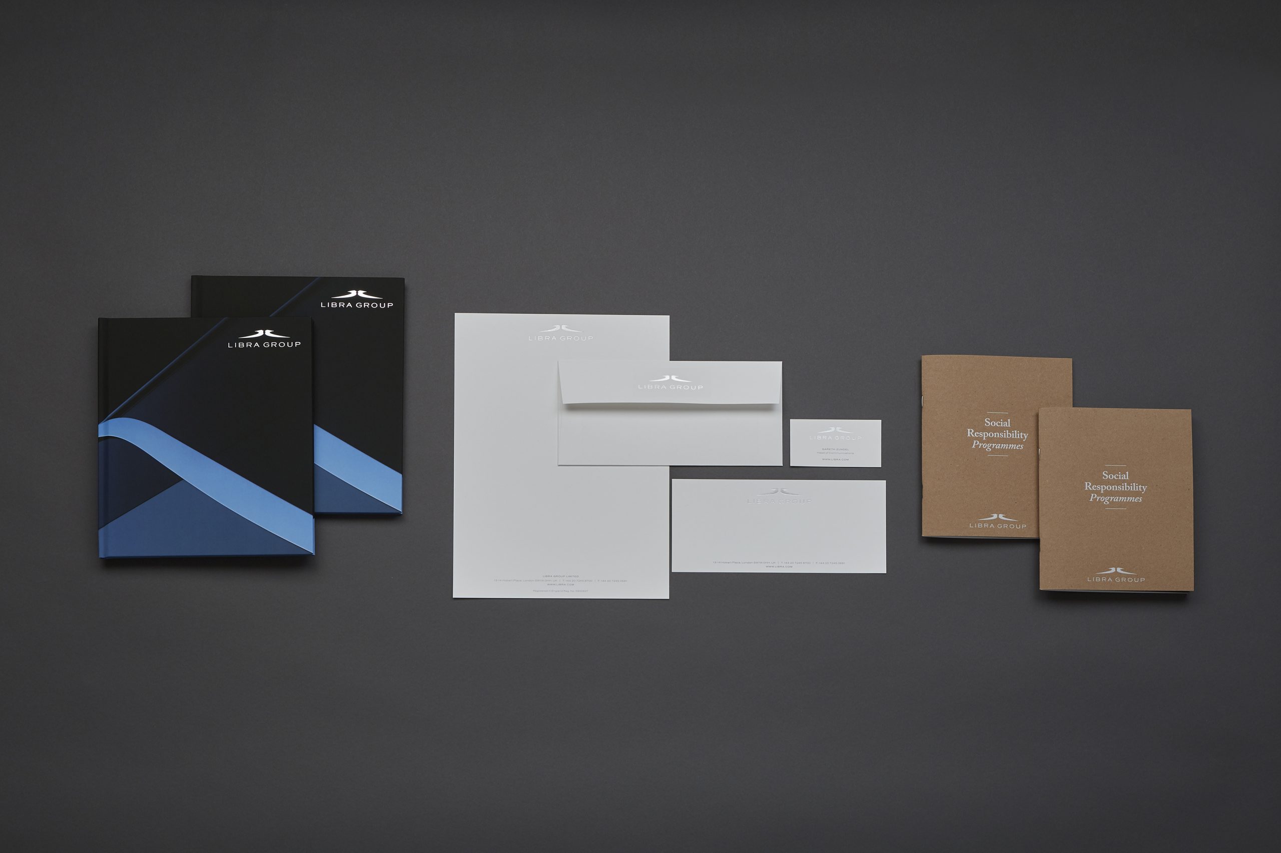
Over a decade after the creation of its original logo, Libra Group has introduced a fresh, modern evolution of its corporate logo. The new visual identity is launched today and will feature across all Libra websites, locations and marketing materials.
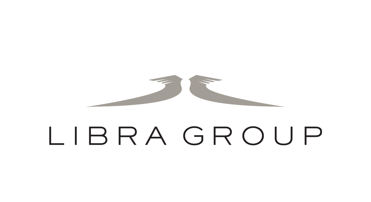
The original Libra logo was designed to evoke the traditional symbols of ‘justice’ with scales representing ‘balance’ and a sense of equilibrium reinforced by the mirror image of the two figures. The shape of the figures was also inspired by the figureheads of traditional sailing ships, echoing the group’s maritime heritage.
The new streamlined version maintains a representation of the mirror image figures to preserve the sense of balance. The logotype font has also been simplified and modernised with a hint of classic Art Deco styling.
“The familiar Libra logo has now evolved into a cleaner, more modern interpretation while invoking the same core values,” commented Executive Vice Chairman, Constantine Logothetis. “This new identity reflects who we are today and what we do as an international business, with 30 subsidiaries active across six continents including a balanced global approach to social responsibility through ten dedicated programmes.”
 Libra appoints new Chief Innovation Officer
  Concordia chooses Athens for first European summit